
42atlas
Maps of meaning, maps of belonging, dislocation, immigration, indigeneity. Atlas of place, urban cartography, environmental haunting. Travel maps, charts, hopeless maps, beloved places, small hells, small paradises. Being in place, in the world, in one’s skin and drawing it
on site review 42: Atlas :: being in place
What is the base map? Is it geographic, the diagram of relative land mass adjacencies, distorted by projection, measured by statistics? Or is it political, full of lines indicating land ownership, coloured in ideologically? Or is it topographic, the physical shape of land measured by experience, full of demarcating landmarks, upon which wars occur? How do we map the change in climate, with our long history of land abuse, which in turn elides with cultural abuse and that put us in present heat-ravaged today?
Mapping, on the other hand, is not just an act of surveying, whether by hand-held transit or by satellite, but is increasingly used as a non-linear metaphor for networks and arrays of information that connect multi-dimensionally in conceptual space. Although eighteenth century European explorers mapped their journeys as lines on a flat surface, their logs contained all the observations about those lines that the line itself is incapable of registering or communicating. Analyses of 'the voyage' through a variety of lenses –– visual, imperial, colonial, environmental, cultural, technological, ecological –– map motion and place very differently. Mapping is both analytical and active –– the charting of a path (for clarity's sake) through a dense interconnected multi-dimensional world.
On Site review 42: Atlas :: being in place, we look at maps of omission and commission, inclusion and exclusion, maps as tools of both domination and liberation, maps that are not drawn but rather are dreamed, known, and are more than charts.
Embassy Cultural House and GardenShip and State supported the contributors to this issue through honoraria.
buy a print copy of this issue:
If you are reading this, you are looking at a screen. If you’ve spent all day looking at a screen, remember, you can place an order for a print version of this issue: beautiful paper, high resolution images –- a thing of beauty, as always. Please choose your region, whether Canada, the United States or everywhere else, aka International.
ordering multiple copies
If you want to purchase more than one copy of this issue, use the www.onsitereview.ca/contact-us form, tell us how many copies you would like - it will be a simple multiplication of the base price, and we will figure out the postage and send you a paypal invoice.
or, you can also subscribe to On Site review
We publish two issues a year, one in the spring and one in the fall. As reading on the web is, essentially, free of charge, we are happy to share this very eclectic and far-ranging journal, but we have a few expenses to even have it online, which are helped by selling the print copies. Unlike digital editions, which can be so easily lost, print hangs around, still valid years later.
donations:
If you would like to donate to On Site review to specifically cover individual honoraria for contributors, please use this paypal Donate button. We do not have charitable status – architecture is always hard to sell as having charitable intentions, so there is no tax advantage to your donations. And as an unfunded, independent journal, we operate on an extremely tight budget. However, if you enjoy reading about the expanded world of architecture, design, landscape, art and urbanism, and would like to support independent writers, thinkers and contributors, we would welcome donations in any amount.
We will send you magazines. And a fulsome letter of thanks. And tell you who your donation has supported.
and we have a Substack newsletter which comes out weekly, more or less. Not news, as much as observations, things seen of interest, things that fall outside the themes of each On Site review, but interesting nonetheless. Sign up below:

“Plan of land bought by the Earl of Selkirk from Peguis and other Indians. 18th July 1817.” Source: Library and Archives Canada, MIKAN no. 4149347. click on the image to enlarge it.

Thursday, June 5, 2014 at 8:38AM
I first saw this map, Selkirk Treaty – Indian Chart of the Red River (undated, but likely accompanied the treaty of 1817/07/18) in Derek Hayes' Historical Atlas of Canada and just thought it the most alive map I had ever seen: the English names on the rivers indicate that north is at the top of the page, the Enlightenment convention where the viewer is located in the place of the sun, Sun Kings all of us. However, the Indigenous chiefs were on the other side of the table, looking at the map from the north, their territory, and signing with their clan marks. Both parties reveal their relationship to land: one is in it, one is looking at it. The chiefs were spatially placed in a supplicatory position in terms of Selkirk's agents; the agents revealed their commodification of the land through both the power of The Map, and their objective view of it.
Nelson's battle plan for Trafalgar, 21 October 1805

Captain Horatio Nelson. Battle plan for the engagement with the combined fleets of the French and Spanish Navies, during the War of the Third Coalition of the Napoleonic Wars off Cape Trafalgar, Spain. 1805 © National Maritime Museum, London.
Sunday, September 27, 2015 at 11:58AM
A wall of ships, the British ships sail toward it planning to cut the line in three, taking out the flagship first, i.e. no signals. Not being a naval historian, and reading a brief summary, it appears that part of the English fleet was at Gibralter, weakening the total Navy, and so the French and Spanish thought they could defend Cadiz by forming a long line in front of it. However, weather will intervene. Little wind and contradictory orders to the French and Spanish to turn resulted in an extremely slow reformation leaving clumps of ships over a loose five-mile line. In come two tight arrow-like British lines. As they all were no doubt luffing around in the same calm weather, the battle must have seemed a bit like slow-motion. However, outnumbered, outgunned and out-shipped, the British won, Nelson was shot and died, and storms that blew up the next day sank several of the wounded ships of the day before.
If there is anything that endears one to Nelson's 'England expects that every man will do his duty' spelled out in signal flags flying from his own flagship, it is this scrap of a battle plan on the back of what looks like a bit of blotting paper. One must never be seen to be trying too hard, but duty is done nonetheless.
Does this kind of thinking exist any more? I only come across it in British espionage novels, those thrilling, complicated, but allegedly deeply conservative tales that pass these days as my escape reading. Ex-SAS men gone rogue sort of stuff. Not really rogue, in the end one finds they are on the side of right and duty. Of course.
Anyway, beautiful little drawing. It moves me to tears for some reason.
Battle of Jutland


Three drawings of The Battle Cruiser Action in the Battle of Jutland during WWI. Taken from History of the Great War - Naval Operations, volume 3, Spring 1915 to June 1916 (Part 2 of 2) by Sir Julian S Corbett. London: Longmans, Green, 1921.
Thursday, October 1, 2015 at 11:30AM
From History of the Great War - Naval Operations. God this is exciting reading. The first drawing above shows the movement of all the battle cruisers in this engagement from 2:45 to 3:00 pm. The next from 3:15 to 3:30, and the thrid from 3:40 to 4pm. The speed is evident. How quickly things moved.
Trafalgar was set up along Army lines: two opposing forces arrayed facing each other except that Nelson changed his line to two perpendicular arrows. By the Battle of Jutland in the North Sea, May 31, 1916, opposing forces appear to operate parallel to each other, in feints and parries. These were battle cruisers, weather not an issue but speed, torpedoes and range were. It looks like a deadly dance chart.
John Thomas Serres: an artist in the Channel Fleet, 1799-1800

John Thomas Serres, Point de Roquilon, France. Captain M. K. Barritt. Eyes of the Admiralty: J T Serres, An Artist in the Channel Fleet, 1799-1800. London: National Maritime Museum, 2014. Image: United Kingdom Hydrographic Office. Don't think you'll find it on the UKHO website however, this appears to be a working website of great complexity for contemporary documents, maps, charts and shipping publications.
Wednesday, March 5, 2014 at 9:56AM
About the time I was young and tooling around on a little sailboat in Nanaimo Harbour, I found a book of drawings of the BC coast done by an artist on Captain Vancouver's ship. They looked much like Serres' paintings (above) – navigation charts, meant to point out signal points, rocks bays, harbours and dangers. These and Vancouver's drawings, which I've never been able to find again, delineated land, not from land itself but from an opposing position on the water. The land is the objective other.
It is interesting, from our map-dominated representations of land today, that in the eighteenth century elevations were as necessary as reckoning by the sun: they are visual one-to-one maps without translation to a plan. Of course they eventually had charts, but Vancouver was in uncharted territory: a drawing or a painting bypassed translation, gave the context and the scale of the coast, especially if it was potentially hostile.
From the water, the land-bound built environment is very small – a toytown between the sky, the mountains and the sea, all huge. Even approaching a city such as Vancouver by ferry, its complex urbanity is itself but a pale cluster, not very tall, almost irrelevant. From the middle of the strait one can see that the Island is the top of a mountain range, that the strait is full of small islands, that there are dozens of boats from tugs to freighters, container ships to barges: daily life on a terrain that remains mysterious to those on land.
Anselm Kiefer: Wilder Kaiser, 1975

Anselm Kiefer. Wilder Kaiser, 1975. Watercolour and acrylic on paper; 6 3/8 x 9 1/2 in. (16.2 x 24.1 cm). Metropolitan Museum of Art 1995.14.11
Tuesday, February 4, 2014 at 8:49AM
Because I was thinking about Keifer after thinking about Gerhard Marx's grass and mud drawings of Johannesburg, I came across this drawing he did in 1975 of what the Met describes as 'the limestone massif of the Kaiser mountain range in northern Tyrol', the Kaisergebirge. The Wilder Kaiser is one ridge, the other is lower and rounder, the Zahmer Kaiser. Somehow, living next to the Rocky Mountain Range, and driving back and forth 1100km to the coast through this range, the Selkirks and the Coast Range, a range of two ridges seems rather European.
Nonetheless, and that is irrelevant, Keifer's Wilder Kaiser is a gesso crag in a watercolour sea. Evidently he worked from a map and included a bit of cartographic information for Predigtstuhl: 2083m.
Because the next issue of On Site review is on mapping, and because it was -26 this morning and it is a tad chilly about the edges here, this particular drawing appeals. Keifer's mapping shows the limits of perception: either what you can see or what you want to know, both necessarily limited. The size of the subject, here a mountain, has nothing to do with the size of a map, or a drawing, or a thought. The name stands in for the range, the gesso peak for one of the individual peaks in it.
Conventional mapping flattens a complex and emotional world to a flat sheet, coded to illustrate topography, and imposing an equivalence on all information that is distinctly misleading. And yet it is so pervasive it has us running around on the surface of the world as if we were on charts, and as if we are incapable of holding opposing thoughts and perceptions in our heads. Yes Predigtstuhl is part of the Wilder Kaiser, but yes too, it is separate from it. For this we need artists.
British Columbia
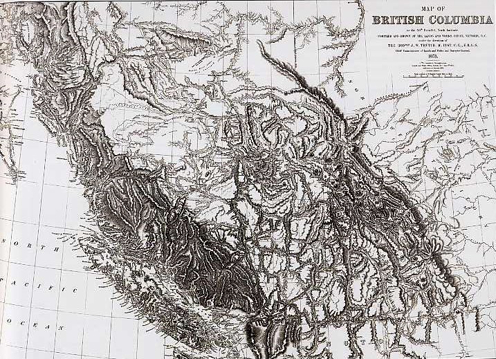
This map is from Derek Hayes' 2002 Historical Atlas of Canada, the most beautiful of all the historical atlas projects. The image is linked to Google books where one can see just how beautiful.
Monday, December 21, 2009 at 6:23AM
One of the conditions of the colony of British Columbia joining Canada in 1871 was the building of an overland link from BC to the rest of Canada. This was the commission given to the CPR and completed in 1884. Is BC a different world than the rest of Canada? They certainly think so.
This map, drawn in the 1870s when much of BC was simply unknown to surveyors and engineers, shows just how much of a conundrum this territory must have seemed. After sailing breezily through the flat land of the prairies where nothing can be hidden from view suddenly there is the wall of the Rockies. Even today, on the much improved Trans-Canada, one cannot get through BC quickly, and the older Highway 3 through the Crows Nest is very convoluted. However, such roads keep one more alert than driving through southern Saskatchewan in a 500 mile straight line.
I like this map for the dismay it seems to exude. BC was going to be a hard project.
Le monde au temps des surrealistes, 1929
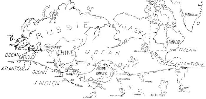
Variétés - Le Surréalisme en 1929 Print, Illustrated book, photomechanical reproduction, letterpress 25.2 h x 17.8 w cm. National Gallery of Australia
Tuesday, January 21, 2014 at 8:04AM
'Le monde au temps des surrealistes', published by Andre Breton in 1929 to show the parts of the world important to the surrealists: the places, named by country, tend to be those with aboriginal art, the operative word being original. Thus Europe, the United States, sites of a kind of universal western culture and product, do not figure.
Jean Claire, in an essay on surrealist anti-materialism and non-western art, mentions the universalising tendencies in Europe at the time: the rise of Hitler's Volk, the appeal to Italian nationalism. Politically the surrealists worked against synthesis, coordination, cultural coherence; masks and arcane rituals appealed precisely because they didn't understand them — they couldn't be appropriated by bourgeois culture.
This is an 80-year old anti-globalisation map. It is also the opposite of anthropology that seeks to understand the non-Western world. The surrealists did not want to understand other cultures, it was important that there were other cultures. Can that be said, eighty years on? As a child, David Bailey had read about Nagaland – a very obscure part of India on the Burmese border, and had always wanted to go there. He went, eventually, in 2012 and found kids with iPhones and jeans and the elders living a thousand-year old life in their heads: when they go, it will go too.
Look up Naga people on wikipedia, one finds a struggle for statehood, a desire for autonomy, the predictable results of colonisation – that insistence that all peoples come under some central authority that they then have to spend much blood and many years to undo. The surrealist map of the world isn't an exercise in sentimental preservation of innocent cultures, rather it can be seen as a map of the post-WWI periphery. The south consists of islands and archipelagoes: a metaphor, contradictory, for the surrealist movement itself.

Christine Hiebert. Wall Drawing / The Drawing Room, Easthampton, NY 2004; blue adhesive tape, glue on wall. 11'-4h x 20'w
This is an artist who has made drawings with blue masking tape since 2000. in this 2012 conversation she mentions when working graphically before computers learned how to draw everything for us, she would make curves using very thin tapes. Yes, I remember this, a physical relationship between hand, tape and eye that was sensual and scaled to the arm: the automatic marks of the anthropos.
On her own website she talks about how the lines are flung out into space as a negotiation of the unknown, or the unexperienced. It seems that how they land on the wall is not unlike a map that precedes experience, indeed, frames experience. The selection of certain marks, the choosing of certain widths of tape, of placements, draws a map of desire and intention. These are landscapes – they follow mapping conventions that are difficult to ignore. However, just because they look like maps does not mean they are maps. They are drawings that delineate planar areas where the borders of each territory are made significant: nothing is blurred, or ambiguous. Some are strong, some weak – have I slipped into metaphor again? Yes. They are pieces of blue masking tape on white paper and white walls that spur us to think of things.

Christine Hiebert. Wall Drawing / The Drawing Center (view #4)
and a very small image, but showing that the scale is way beyond the hand and arm, it is now the wall, the ladder and the whole body.

Christine Hiebert. RoundTrip. A wall drawing for the Pinakothek der Moderne, 2005
Bangalore to Halifax

Plan of Bangalore, 1791
Wednesday, June 20, 2012 at 8:42AM
This plan of the original fort at Bangalore is from a most interesting site, deeplythinking. The note across the top says: Plan of Bangalore (with the Attacks) taken by the English Army under the command of the Rt Hon'ble Earl Cornwallis March 22 1791. He was related to the Cornwallis, Lieutenant-Governor of Nova Scotia, who founded Halifax in 1749 to counter French interests established at Louisbourg.
Deeply Thinking Guruprasad says this attack plan map was part of the Third Anglo-Mysore War and shows the fort, the walled pendant hanging from the town which was surrounded by thick bushes and hedging. Bangalore became a British military base in 1809, developing over the next hundred years into the old town, the Petta, and the new station.

Bangalore, 1924
What a diagram of British colonialism: the old town, the Petta and fort supervised by adjacent gridded suburbs, the station separated from the native quarter by a wide zone of parks and parade grounds. Richards Town, Fraser Town and Cleveland Town northeast of the Cantonment Bazaar were probably named after officers and their companies, much the way Halifax streets were named after the companies stationed in barracks on them. On the native side are the jail, the plague camp, the cemetery, the veterinary camp for the horses. On the British side are the Maharaja's palace, the polo ground and no doubt other sites of safety. (go to the original site by clicking on the pictures for enlarged versions of these maps – they are really interesting in detail)
In fact, this is all much like Halifax which, as late as 1960, allowed African-Canadians to crowd into Africville at the extreme northern end of the city, separated from the city itself by commons and an ambiguous zone that contained a mental hospital, a jail, and the city dump. No such thing as disinterested urbanism: social relations are deeply embedded and last for centuries.